The pursuit of perfect, mathematical symmetry is precisely what makes most grid-style floral arrangements feel static and lifeless.
- True architectural balance comes from hidden structural integrity and balancing ‘visual weight’—not just mirroring physical placements.
- Intentionally introducing ‘controlled asymmetry’ and using negative space (‘ma’) are the professional secrets to creating dynamism and a sophisticated focal point.
Recommendation: Shift your focus from achieving sterile perfection to engineering a living, balanced structure that embraces deliberate imperfection.
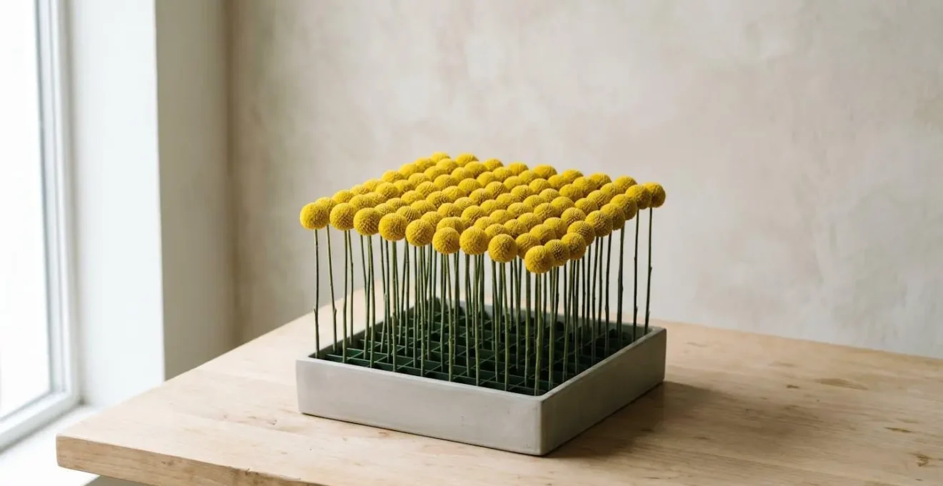
For the owner of a minimalist interior, floral decor is not an afterthought; it is a considered architectural element. The appeal of a grid-structure arrangement is its clean geometry and order, a floral design that speaks the same language as the space it inhabits. The common advice often starts and ends with mechanics—stretching tape over a vase or using chicken wire—and pushes for a flawless, uniform block of colour. The result is often technically correct but emotionally vacant, lacking the sophisticated energy it promised.
This approach misses a fundamental point understood by designers and architects. The goal isn’t just to hold stems in a row, but to create a composition with rhythm, balance, and life. While the grid provides the underlying framework, the artistry lies in how that framework is used, or even subverted. What if the secret to a breathtakingly modern arrangement wasn’t achieving perfect symmetry, but mastering its deliberate disruption?
This guide moves beyond basic mechanics to explore the design theory behind professional grid arrangements. We will deconstruct the process as an architect would, focusing on structural integrity, material selection, and the advanced techniques of balancing visual weight and using negative space. You will learn not just how to build a grid, but how to infuse it with the subtle dynamism that separates a mere centerpiece from a true work of art.
To fully grasp these architectural principles, this guide is structured to build your expertise from the foundational mechanics to advanced design philosophies. The following sections will walk you through each critical stage of creating a balanced, dynamic, and structurally sound grid arrangement.
Summary: Creating Architectural Floral Grids: A Design-Led Approach
- Why Floral Foam Alternatives Are Better for Structured Grid Arrangements?
- Which 6 Flowers Have Naturally Symmetrical Heads for Architectural Designs?
- Vertical Tower or Horizontal Grid: Which Structure Suits a Long Dining Table?
- Why Perfect Symmetry Feels Lifeless: The Controlled Asymmetry Technique
- When to Replace the First Fading Bloom to Keep a Grid Arrangement Intact?
- Hand-Tied Spiral or Parallel Build: Which Technique Creates a Fuller Silhouette?
- Why the Empty Space in Your Ikebana-Style Arrangement Is Not a Mistake?
- How Do Artisan Florists Create Bouquets That Look Unstructured Yet Perfectly Balanced?
Why Floral Foam Alternatives Are Better for Structured Grid Arrangements?
The foundation of any architectural design is its structural integrity. For decades, water-retentive floral foam was the default mechanic, but for precise grid-work, it is fundamentally flawed. Its single-use nature is an environmental concern, but from a design perspective, its main failure is its lack of precision and reusability. Puncturing foam creates a permanent hole; repositioning a stem is difficult and weakens the entire structure. The foam crumbles, clouds the water, and shortens the life of the blooms by inhibiting true water uptake and promoting bacterial growth.
Modern alternatives—such as reusable metal pin frogs (kenzans), wire armatures, or built-in lid grids—offer far superior control. These mechanics provide a stable, non-degrading foundation that allows for millimeter-perfect placement. Stems can be inserted, evaluated, and repositioned without compromising the structure. This ability to adjust is not a sign of indecision; it is a crucial part of the design process, allowing the florist to fine-tune angles and spacing to achieve a deliberate architectural effect.
Furthermore, these alternatives ensure every stem has direct access to clean water, maximizing its lifespan. This is critical in a minimalist grid where each individual bloom is exposed and its condition is paramount to the overall aesthetic. The mechanics become a permanent, reliable scaffold rather than a disposable and unstable filler.
Case Study: The Reusable Grid Advantage
Floral designer Derek Woodruff documented the long-term benefits of shifting to reusable grid mechanics. Over three years, he completely eliminated the waste from single-use floral tape, which he calculated at 60 yards per roll. More importantly, he achieved superior angle control for his architectural designs. The grid system allows stems to be positioned with precision and, crucially, removed for maintenance or replacement without disturbing any neighboring stems, maintaining the integrity of the complex arrangement over time.
Ultimately, choosing a foam-free mechanic is not just an ethical choice; it’s a strategic design decision that prioritizes precision, longevity, and structural integrity—the very cornerstones of an architectural arrangement.
Which 6 Flowers Have Naturally Symmetrical Heads for Architectural Designs?
Once a stable mechanical base is in place, the focus shifts to material selection. In architectural floristry, a flower is chosen not just for its colour, but for its form. For a grid design, blooms with naturally symmetrical heads provide the building blocks for a clean, geometric composition. These are flowers whose petals or florets are arranged in a predictable, radial, or spherical pattern, lending themselves to the repetition and order of a grid.
However, head-shape is only one part of the equation. The flower’s entire structure must possess architectural qualities. This includes a naturally rigid stem that can stand vertically without support and petals with good turgor pressure that resist wilting. The goal is to select botanicals that behave predictably, holding their form over the life of the arrangement. Varieties that open unpredictably or become asymmetrical as they age, such as many garden roses, can disrupt the intended geometry.
Integrating these symmetrical blooms with equally rigid and linear foliage, like Steel Grass or Equisetum (Horsetail), further reinforces the grid structure. The foliage acts like visual rebar, guiding the eye and emphasizing the geometric lines of the design. The following framework helps in assessing a bloom’s suitability for this precise work.
As the visual comparison shows, flowers like the Allium, Gerbera, and Craspedia possess an inherent geometric precision. This makes them ideal components for building a structured design, as their form is consistent and predictable from every angle. Their selection is a deliberate choice for order and clarity.
- Allium: Its perfectly spherical head is a globe of tiny, star-shaped florets, offering texture and a pure geometric form.
- Craspedia (Billy Ball): A dense, firm, and perfectly round yellow sphere on a wiry stem, it’s the epitome of a geometric accent.
- Gerbera Daisy: Characterized by its concentric rings of petals radiating from a central disk, it offers a classic, flat, two-dimensional symmetry.
- Anthurium: While not radially symmetrical, its clean, heart-shaped spathe and linear spadix provide a modern, graphic quality. Its waxy texture ensures longevity.
- Calla Lily: Valued for its elegant, sculptural form and strong, clean lines. The bloom’s funnel shape provides a directional element within the grid.
- Protea: Many varieties, like the King Protea, have a large, cup-shaped structure and a bold, symmetrical form that acts as a powerful focal point.
By curating a palette of flowers based on these structural criteria, you are no longer just arranging blooms; you are assembling architectural components into a coherent and stable whole.
Vertical Tower or Horizontal Grid: Which Structure Suits a Long Dining Table?
With mechanics and materials selected, the next architectural decision is the overall form. On a long dining table, two primary structures present themselves: the low, sprawling horizontal grid, and the tall, slender vertical tower. The choice is not merely aesthetic; it is a matter of social ergonomics. The primary function of a dining table is to facilitate conversation, and the centerpiece must enhance, not obstruct, this purpose.
Vertical arrangements, or « towers, » can bring drama and height to a room, drawing the eye upward. However, on a dining table, they create a visual barrier. While a very slender base might allow guests to see « around » the arrangement, it often forces them to peer around stems, creating a subtle but persistent social obstacle. For this reason, event design research confirms that low centerpieces should remain under 12 inches to maintain clear sightlines across the table. This constraint makes the horizontal grid the functionally superior choice for this context.
A low, horizontal grid respects these sightlines, fostering an intimate and connected atmosphere. It becomes a « floral runner, » echoing the table’s length and creating a sense of visual rhythm. This form is also more practical for serving, as staff can easily navigate around it. The structure can even incorporate subtle variations in height—for example, a pattern of 10cm, 12cm, and 10cm blooms—to create gentle movement without breaking the crucial 12-inch rule.
The following matrix breaks down the suitability of each structure for a long dining table, reinforcing the horizontal grid as the optimal solution for both aesthetic and social function.
| Design Factor | Horizontal Grid (Under 12 inches) | Vertical Tower (24+ inches) |
|---|---|---|
| Conversation Sightlines | ✓ Maintains clear eye contact across table | ✓ Allows views underneath if on narrow base |
| Table Length Suitability | ✓ Ideal for long rectangular tables (6-12 ft) | ⚠ Best as end-cap accents, not centerpieces |
| Visual Rhythm Options | ✓ Can create height variations (10-12-10 cm pattern) | ✗ Single height creates static vertical line |
| Guest Interaction | ✓ Encourages intimate, social atmosphere | ⚠ Creates formal, dramatic ambiance |
| Serving Accessibility | ✓ Servers can easily navigate around low arrangement | ⚠ Requires careful placement to avoid collisions |
| Modular Flexibility | ✓ Multiple small grids can be rearranged | ✗ Fixed, non-modular single statement piece |
| Recommendation: For long dining tables, horizontal grids under 12 inches are optimal for social ergonomics, while vertical towers (24-30 inches) work only as end-cap bookends. | ||
In short, while a vertical tower is a statement, a horizontal grid is a conversation. For a dining table, the conversation should always win.
Why Perfect Symmetry Feels Lifeless: The Controlled Asymmetry Technique
You have the mechanics, the architecturally sound flowers, and the optimal horizontal form. You build a perfectly symmetrical grid. Each flower is a mirror image of its counterpart. Yet, the result feels flat, sterile, and strangely lifeless. This is a common paradox in design: the human eye appreciates order, but it is captivated by life, and life is never perfectly symmetrical.
This is where we move from technician to artist. The secret to breathing life into a geometric arrangement lies in the technique of controlled asymmetry. This involves creating a predominantly symmetrical and ordered pattern, and then intentionally breaking it in one or two strategic places. This small, deliberate disruption does two things: it creates a natural focal point, giving the eye a place to rest, and it introduces a sense of dynamism and visual tension that makes the entire composition more engaging.
This principle is deeply rooted in Eastern aesthetics, particularly the Japanese concept of wabi-sabi, which finds beauty in imperfection. As the journal Floristry Art Of Living explains, this philosophy is key to creating harmony.
Wabi-sabi rejects perfect symmetry, instead favoring asymmetry to create arrangements that feel unbalanced but in a harmonious way
– Floristry Art Of Living, A Guide to Wabi-Sabi in Floristry: Embracing Imperfection and Transience
Applying this to a Western grid might involve replacing one of the uniform blooms with a flower of a different colour, texture, or form. It could be a single, dark-hued rose in a field of cream, or an organically curving Calla Lily stem that cuts diagonally across the rigid lines of the grid. The key is that the asymmetry is controlled and intentional. It’s not a mistake; it’s a decision. This single point of difference doesn’t destroy the grid’s order; it highlights it by providing a point of contrast.
By embracing controlled asymmetry, the arrangement moves beyond being a simple pattern and becomes a composition with a story, a focal point, and a spark of life.
When to Replace the First Fading Bloom to Keep a Grid Arrangement Intact?
An architectural floral arrangement is a living installation, and its perfectionist aesthetic requires vigilant maintenance. In a dense, varied bouquet, a single fading bloom can go unnoticed. In an exposed grid, however, one wilting flower can compromise the integrity of the entire design. The question is not *if* you should replace it, but *when* and *how* to do so without disturbing the precise mechanics.
The key is pre-emptive action. Waiting for a bloom to become visibly brown or fully wilted is too late; the design has already been compromised. The professional approach is a form of surgical triage, where blooms are assessed daily and replaced at the first sign of decline—often when they have lost just 20-30% of their turgor (firmness) or vibrancy. This proactive maintenance preserves the flawless appearance of the grid.
This requires planning from the very beginning. When creating the arrangement, a system of « understudies »—several extra stems of each flower variety, conditioned and cut to the exact height—should be prepared. This allows for a seamless replacement. Furthermore, strategic placement can make maintenance easier: position flowers with shorter known lifespans (like delicate sweet peas) in easily accessible outer grid cells, while hardier blooms (like chrysanthemums) can occupy the more difficult-to-reach interior positions.
The replacement itself must be a swift, surgical procedure. Using fine tweezers or floral snips, the fading stem is gently twisted and lifted straight out to avoid disturbing its neighbours. The pre-prepared understudy stem is then immediately inserted into the vacant spot, minimizing the time the mechanical grid is exposed and ensuring the structural and visual integrity remains intact. This protocol transforms maintenance from a reactive chore into a proactive part of the design’s lifecycle.
Your Action Plan: Surgical Floral Triage & Replacement
- Pre-emptive Assessment (70% Rule): Inspect blooms daily. Plan to replace any flower that has lost roughly 30% of its initial firmness or colour vibrancy, well before it looks visibly wilted.
- Diagnostic Evaluation: Distinguish between temporary wilting (which may be fixed by recutting the stem underwater) and irreversible decline (browning petals, translucent stem). Only the latter requires replacement.
- Set Up an Understudy System: When you first create the arrangement, condition and prepare 2-3 extra stems of each flower type, cut to the correct height and kept in a separate vase of water for quick swaps.
- Plan for Graceful Degradation: Place your most delicate, shorter-lived flowers in the most easily accessible positions on the outer edges of your grid for easier surgical removal.
- Master the Surgical Removal: Use fine-tipped tweezers or snips to gently grasp the stem at its base. Twist and pull straight up to extract it without bending adjacent pins or disturbing other stems.
By treating the arrangement not as a static object but as a living system, you can maintain its intended architectural perfection for its entire lifespan.
Hand-Tied Spiral or Parallel Build: Which Technique Creates a Fuller Silhouette?
When discussing hand-held bouquets, the debate between a spiral and parallel technique is central. A spiral build, where stems are added at an angle, creates a classic, full, dome-shaped silhouette. A parallel build, where stems are kept straight and vertical, results in a more compact, modern, and upright form. But how does this apply to a grid-structure arrangement set in a vessel? The answer is: neither technique is directly applicable, but the principles behind them inform a more sophisticated, hybrid approach.
A grid arrangement within a vase is, by its nature, a parallel build. Each stem is inserted vertically (or at a controlled angle) into the mechanic, independent of the others. This is what creates the clean, architectural separation between elements. A hand-tied spiral is designed to be self-supporting and held in the hand; its logic is irrelevant once a vessel and mechanics are introduced. The challenge, therefore, is how to achieve a sense of fullness and stability without the interlocking structure of a spiral.
This has led to innovative methods that create an internal, hidden structure within the vase, combining the stability of a parallel build with the distributed support of a more complex armature. This ensures precise positioning while creating a foundation for a full and robust design.
Case Study: The Internal Scaffold Method
To create a full spring centerpiece with the precision of a grid, designer Sarah Raven documented an innovative approach that functions as an internal scaffold. She layered straight, hardy branches (like dogwood or willow) in an interlocking grid pattern directly inside the shallow bowl, tying them at each overlap. This created a natural, organic armature. Flowers could then be inserted into this pre-built grid, allowing for precise positioning while the scaffold provided robust, distributed support. This technique cleverly combines the vertical stability of a parallel build with the structural integrity of a custom-built, point-to-point framework, rendering the hand-tied-versus-parallel debate moot for this application.
Ultimately, for vessel-based grid designs, the most effective technique isn’t a hand-tied method at all, but a piece of internal engineering that establishes the rules of the grid before the first flower is even placed.
Why the Empty Space in Your Ikebana-Style Arrangement Is Not a Mistake?
In Western floral design, the instinct is often to fill. We see a space, and we add a flower. This can lead to arrangements that are dense, heavy, and visually overwhelming. The grid structure, if filled completely, can suffer from this same fate—a monotonous block of colour and texture. A more sophisticated approach, drawn from the Japanese art of Ikebana, is to embrace the principle of negative space.
In Japanese aesthetics, this intentional emptiness is known as ‘ma’ (間). It is not a void or a mistake; it is a deliberate and essential component of the composition. ‘Ma’ is the pause in a piece of music, the white space on a painted scroll. It is the quiet that gives shape and meaning to the sound and the form. As Thursd Garden Design Journal notes, this concept is about creating room for thought.
The principle of ‘ma’—intentional emptiness between elements—gives arrangements lightness and invites contemplation, allowing individual plants to shine while creating opportunities for quiet reflection
– Thursd Garden Design Journal, Embracing Imperfection in the Art of Wabi-Sabi With Plants and Flowers
Applying ‘ma’ to a Western grid arrangement is a transformative technique. Instead of filling every single cell of your grid, you intentionally leave some empty. This could be a symmetrical pattern of voids—for instance, leaving the four corner cells empty—or an asymmetrical scattering of empty spaces. This does two remarkable things. First, it prevents visual density and allows each individual bloom to be seen and appreciated. Second, the pattern of voids paradoxically emphasizes the perfection of the grid itself by making the geometric framework visible. The design is transformed from a solid ‘grid’ into an airy ‘lattice’.
Case Study: Symmetrical Void Patterns in Grid Design
Contemporary florists are increasingly applying the principles of Ikebana to structured grid arrangements. By intentionally leaving every third or fourth cell in a floral grid empty, they create a powerful visual rhythm. In some designs, filling a void with a single, delicate element like a wisp of bear grass introduces texture without adding mass. The use of symmetrical voids, such as leaving opposing corner cells empty, has been shown to paradoxically enhance the architectural quality of the arrangement. This makes the underlying geometric framework a visible and celebrated part of the design, turning what could be a dense block of flowers into a light, architectural lattice defined by its elegant empty spaces.
By integrating ‘ma’ into your grid, you add a layer of intellectual and visual sophistication, creating an arrangement that invites contemplation rather than just admiration.
Key Takeaways
- True architectural balance comes from hidden structural integrity and mastering ‘visual weight’, not just physical symmetry.
- The most sophisticated designs embrace ‘controlled asymmetry’ and ‘negative space’ to create dynamism and life.
- Choosing flowers for their structural properties (stem rigidity, symmetrical heads) is as important as choosing them for their colour.
How Do Artisan Florists Create Bouquets That Look Unstructured Yet Perfectly Balanced?
The hallmark of an artisan florist is the ability to create arrangements that feel effortlessly natural yet are perfectly balanced and structurally sound. This is particularly true for grid designs, which must reconcile rigid geometry with organic life. The secret to this apparent paradox lies in mastering two advanced concepts: the hidden mechanical foundation and the principle of visual weight.
First, as the Sustainable Floristry Network points out, perceived effortlessness is always built on a foundation of technical excellence. The visible beauty must be supported by an invisible, impeccably built structure.
The secret to ‘unstructured’ balance is a hidden, stable core—the visible symmetry must be supported by an impeccably built, invisible mechanical foundation
– Sustainable Floristry Network, Floral Foam Alternatives Guide
This means using robust, reusable mechanics (as discussed in Section 15.1) that allow for precise and secure placement. The balance you see is a direct result of the stability you cannot see. The second, more nuanced concept is that of visual weight. True compositional balance is not about physical symmetry (placing two identical objects in mirror positions). It is about balancing the perceived weight of the elements. Various factors influence visual weight: dark colours feel heavier than light colours; complex textures feel heavier than smooth surfaces; large forms feel heavier than small forms.
An artisan florist plays with these properties to achieve balance. They might balance a large, pale peony on one side of the grid with a smaller, intensely dark dahlia on the other. The physical masses are unequal, but their visual weights are balanced. This is how an arrangement can feel harmonious without being perfectly symmetrical. It’s an intuitive understanding of physics and psychology applied to organic material, as the following table illustrates.
| Element | Physical Symmetry (Mirror Placement) | Visual Weight Symmetry (Balanced Perception) |
|---|---|---|
| Identical Light Pink Roses | Mirror positions create physical symmetry | ⚠ May appear unbalanced if one side receives more light |
| Dark Purple vs. Light Pink (Same Size) | ✗ Not physically symmetrical | ✓ Can achieve visual balance: dark color has ‘heavier’ weight |
| Large Simple Bloom vs. Small Complex Cluster | ✗ Different physical mass | ✓ Visual balance: complexity adds perceived weight |
| Smooth Petal vs. Textured Filler | May be same size physically | ⚠ Texture draws eye and adds visual weight |
| Focal Bloom at Grid Center | ✓ Physically centered | ✓ Requires balanced visual weight on all sides |
| Key Principle: True grid symmetry requires balancing visual weight (color, texture, complexity) not just physical placement—a small dark flower can balance a large pale one. | ||
By combining a flawless hidden structure with a sophisticated understanding of visual weight, you can finally create grid arrangements that are both architecturally sound and dynamically alive.